How to Use Neutral Colour Palettes in a Nursery
Last Updated: October 25, 2026
Quick Summary
A neutral nursery works because soft, low-contrast tones give a baby's eyes somewhere calm to rest, and the palette keeps working as the child grows. Cream, sand, oat and mushroom tones already match whatever you add later, so the room does not need redecorating at the toddler stage.
- Stand in the doorway at dusk with the main light off; the room should read as one soft wash of colour.
- Keep everything within two or three shades of each other and let texture separate the layers.
- Test paint on a large sample board on the wall that gets the least light, checking it across a full day.
- Add colour in small, removable doses: one accent colour used three times in three different materials.
- Layer at least three textures on any surface you look at most, and remove an object if a surface holds more than three.
Table of Contents
- Why Neutral Colour Palettes Suit a Nursery So Well
- Nursery Colour Psychology: What Soft Tones Actually Do
- Neutral Nursery Colour Schemes Worth Copying
- Choosing Warm Neutral Nursery Colours
- How to Add Colour to a Neutral Nursery
- Making a Neutral Nursery Feel Warm, Not Bland
- Pulling Your Neutral Nursery Together
- Frequently Asked Questions
Why Neutral Colour Palettes Suit a Nursery So Well
A neutral nursery works because soft, low-contrast tones give a baby's eyes somewhere calm to rest, and they keep working as the child grows. This guide from JÈYS & I covers why neutral colour palettes are best for nurseries, which schemes hold up over time, and how to stop a quiet room tipping into blandness.
Here is the part most guides skip: a nursery is not a showroom. It is a room where a baby will sleep, feed, cry and eventually crawl, and the palette has to survive all of it. Strong colour dates fast and photographs badly at night. Neutrals forgive.
The case for restraint is practical rather than fashionable. A palette built on cream, sand, oat and mushroom gives you a room that already matches whatever you add later, from a gifted blanket to a hand-me-down chair. It also makes the small things you do choose, a textured cushion, a patterned throw, feel deliberate rather than noisy.
A Calmer Room for Sleep and Play
Sleep pressure in babies is shaped by light and stimulation, and a room that is visually quiet supports the wind-down routine rather than competing with it. That is the reasoning behind keeping walls, textiles and larger surfaces in soft, closely related tones. NHS guidance on helping your baby to sleep safely sets out the practical side of sleep routines; the visual environment is the supporting act.
There is a simple test. Stand in the doorway at dusk with the main light off. If the room reads as one soft wash of colour, you have got it right. If your eye jumps to three different focal points, the palette is doing too much for a room whose main job is rest.
For parents who want to take this further, sensory-friendly baby nursery ideas covers low-stimulation layouts and lighting that pair naturally with a neutral scheme.
A Room That Grows With Your Child
Neutral is the only palette that does not need redecorating at the toddler stage. A room painted in strong pink or navy tends to get repainted once preferences arrive; a room in oat and warm grey simply absorbs new bedding, new art and a small person's opinions.
Think of it as buying yourself time. The walls stay, the curtains stay, and the money you would have spent on a repaint goes towards the things that actually change.
Nursery Colour Psychology: What Soft Tones Actually Do
Nursery colour psychology is the study of how tone, saturation and contrast affect a baby's arousal and a parent's sense of calm, and the short answer is that muted, low-saturation tones are less stimulating than bright primaries. That does not mean colour is bad for babies. It means the intensity and the quantity matter more than the hue.
A useful distinction: saturated colour is an event, muted colour is a background. Babies respond to faces, movement and contrast, and they get plenty of that from the people around them. The room does not need to compete.
Be careful with claims here. No palette guarantees better sleep, and any article telling you otherwise is overselling. What a calm room reliably does is make the bedtime routine easier for the adult running it, which matters more than most parents expect at 3am.
Neutral Nursery Colour Schemes Worth Copying
Three neutral nursery colour schemes do most of the work, and each has a different temperature. Pick by the light in your room, not by a photograph on a screen.
| Scheme | Core Tones | Suits | Watch Out For |
|---|---|---|---|
| Cream, sand and oat | Cream, sand, oat, pale biscuit | North-facing rooms, small rooms | Can read cold under cool white bulbs |
| Warm grey and mushroom | Mushroom, taupe, warm grey, soft stone | Rooms with lots of daylight | Grey can turn blue in shadow |
| Soft sage and clay | Muted sage, clay, putty, warm white | Period properties, larger rooms | Sage shifts green under warm lamps |
Cream, Sand and Oat
The warmest and most forgiving of the three. Cream and sand bounce light around a dim room, which is why they suit smaller spaces and rooms that never quite get direct sun. Keep everything within two or three shades of each other and let texture separate the layers.
Warm Grey and Mushroom
Mushroom and taupe carry more depth than cream without becoming a statement. This scheme handles daylight well and looks particularly good against natural wood. The risk is temperature drift: a cool grey next to a cool white ceiling can tip the whole room towards blue, so pair it with a warm white on the trim.
Soft Sage and Clay
Sage and clay add a whisper of colour while staying firmly in neutral territory. It is the scheme most likely to survive a child's changing tastes, because it reads as grown-up without reading as adult-only. If you are weighing specific combinations, how to style a gender-neutral baby room walks through tone pairings before you commit.
Choosing Warm Neutral Nursery Colours
Warm neutral nursery colours are the ones with a yellow, red or brown base rather than a blue or green one, and they are what stop a neutral room feeling clinical. The practical way to choose is to test in the room itself, on the wall that gets the least light.
- Paint a large sample board rather than a small patch, and move it around the room across a full day.
- Check the sample at night under the lamp you will actually use.
- Hold your fabric swatches against the sample, not against a screen.
- Compare the sample with your flooring, since a warm rug and a cool floor pull a wall colour in opposite directions.
A common mistake is choosing from a paint chip in a bright shop. Shop lighting flatters almost everything. The same mushroom that looks rich on the card can turn flat and grey in a north-facing room, and you will only see it once the second coat is dry.
How to Add Colour to a Neutral Nursery
Adding colour to a neutral nursery works best in small, removable doses: soft furnishings, books, a single piece of art, a woven basket. The rule of thumb is one accent colour, used three times, in three different materials.
Try a muted terracotta repeated in a cushion, a print and a storage basket. Or a soft ochre in a lampshade, a quilt and a shelf object. Repeating a single accent across materials makes the room look considered; scattering five colours makes it look unfinished.
Keep saturation low. A dusty rose or an olive green sits comfortably against cream and sand, while a bright primary will fight everything around it. If you want the colour to feel intentional rather than accidental, choose it after the neutrals are in place, not before.
Making a Neutral Nursery Feel Warm, Not Bland
The fear that a neutral room will feel bland is the most common objection, and it is a fair one. The answer is texture, layering and a slow build, not more colour.
Texture Does the Work Colour Usually Does
Texture is what separates a considered neutral room from a beige box. A chunky knit, a brushed cotton, a smooth ceramic and a woven basket all read as different tones even when they are the same colour, because they catch light differently.
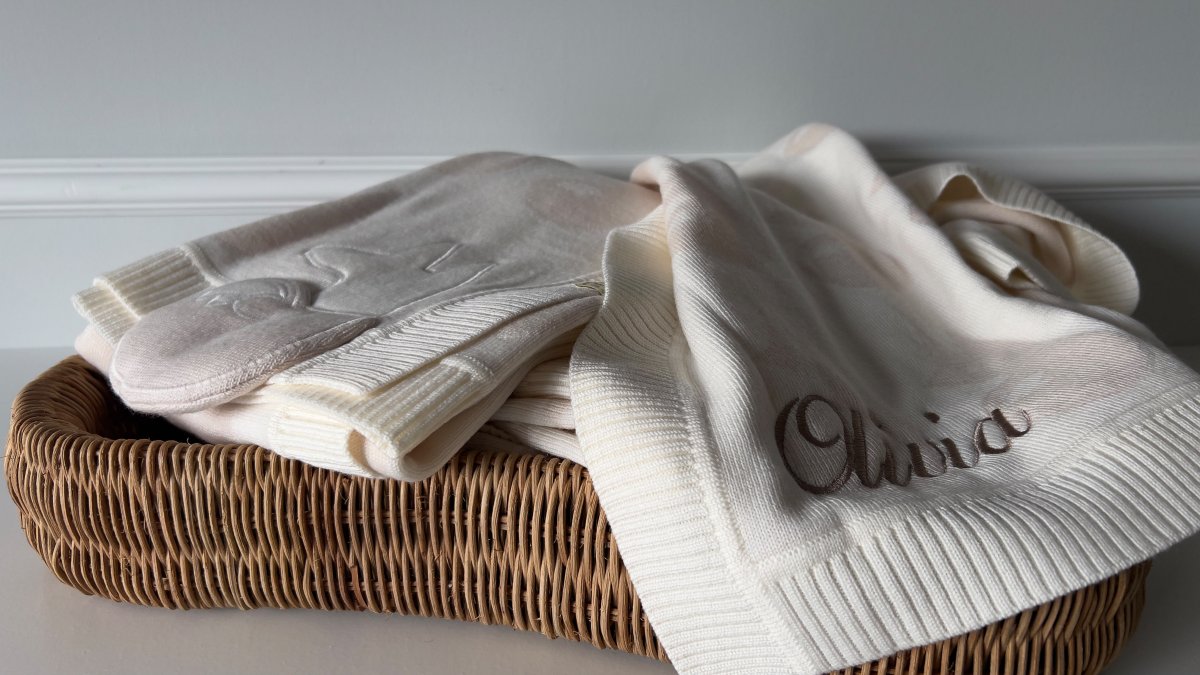
Layer at least three textures on any surface you look at most: the chair, the changing area, the shelf. A cream merino wool blanket over the arm of a chair adds softness and a little weight, and the Signature Jacquard Merino Wool Blanket - Cream does exactly that job with its double-layer jacquard knit and softly padded fox appliqué.

Watch out: piling on texture without editing creates clutter rather than warmth. If a surface has more than three objects on it, remove one.
Small Accents, Added Slowly
Add accents one at a time and live with each for a week before adding the next. This is the single biggest difference between a room that feels collected and one that feels bought in a single afternoon.
Start with something that has character but stays inside the palette. A sculptural piece like the Signature Fox Decorative Pillow introduces personality through shape and embroidery rather than colour, which is exactly the balance a neutral room needs.

Pulling Your Neutral Nursery Together
Finishing a neutral nursery comes down to editing: fewer objects, better textures, and one accent repeated with intent. Walk in, look at the first three things your eye lands on, and ask whether each one earns its place.
The last piece is usually the softest one. A well-chosen blanket ties the palette together because it sits at eye level from the chair and gets used every day. If you are deciding between weights, fibres and sizes, choosing the perfect merino wool baby blanket sets out what to look for before you buy.
A neutral nursery asks one thing of you: restraint, followed by patience as you layer in texture and small accents over time. That is where JÈYS & I can help. The Signature Comfort Collection brings together three coordinated pieces in cream and sand tones, blending extrafine merino wool with the Etelvina Pattern and the signature fox, while the Ultimate Luxury Collection gathers five pieces into one gift-ready set. Get started with JÈYS & I and build a nursery that still feels right years from now.
Frequently Asked Questions
Why are neutral colours popular for nurseries?
Neutral palettes give you a room that works before you know anything about your baby's personality, and keeps working as they grow. They are easier to coordinate with gifts and hand-me-downs, they do not need repainting when tastes change, and soft tones keep the room restful rather than stimulating. Many parents also find a neutral nursery simpler to style, because texture and natural materials carry the visual interest instead of bold pattern.
What are the best warm neutral nursery colours?
Cream, sand, oat, mushroom and warm greys are the easiest starting points. They have a little yellow or red in them, so they read as cosy rather than clinical under artificial light. Pair one wall or larger surface in a mid-tone with lighter tones around it, then bring in warmer accents through textiles. Cool greys and stark whites can look chilly in a north-facing room, so test a sample patch on the wall at different times of day before committing.
How do I add colour to a neutral nursery without losing the calm feel?
Add colour in layers you can remove: a cushion, a blanket, a framed print, a woven basket. Choose one or two accent colours that already appear in the room and repeat them in small doses rather than spreading several new shades around. Deep tones such as terracotta, olive or dusty blue work well against cream and sand because the contrast is clear but the saturation stays low. Keep the walls and larger pieces neutral so the accents are easy to swap later.
Will a neutral nursery look bland or unfinished?
Only if everything in it is the same tone and the same texture. The fix is contrast: mix a smooth wall with a chunky knit, a matt paint with a woven basket, a flat cushion with an embroidered or appliqued detail. Vary the depth of your neutrals too, using one darker tone against two lighter ones. A single sculptural or textured piece, such as a decorative pillow, often does more for a neutral room than another layer of colour would.